Website Redesign Discovery
A short term contract role that helped Parkinson’s UK better understand their website users and needs. The research also identified key areas of focus for the website redesign.
Stakeholders: Product, UX Design, Service Design, Content Team including Head of Content, Director of External Relations, Donations Team, Professional Services Team, Membership Team
Tools: Hotjar, Google Analytics, Lyssna, Lucid Spark
Methods: Heuristic Review, Journey Analysis, Jobs to be Done, Empathy Maps, User Interviews, Surveys, Card Sorting, Data Analysis, Workshops, Surveys
June to September 2024
Problem

Parkinson’s UK wanted to refresh their website because they believed the design was outdated. This was considered a high profile project and as such the senior leaders in the organisation wanted both to be involved and change to happen quickly.
The brief was to conduct user research to understand how people were using the website.
The initial problem was the team did not understand enough about the different types of website users and what they were using the website for, therefore, they didn’t know how to structure content to help users find what they need quickly and easily.
There were many teams across the organisation invested in the website. They were all looking to ensure their areas had the right amount of exposure and so balancing their needs with the user needs was expected to be a challenge. Most of these teams outside of the digital space had limited knowledge and understanding of Product, UX Design and Research.
Research Methods and Process
Research Goals:
Understand the website users and their needs
Define a shared understanding of what the website is for
Identify key areas of focus for the discovery research
Deepen understanding of these areas, identify pain points and opportunities
Process:
Phase 1
Understand the organisation and what’s been done so far
Data Analysis to understand how the website is currently performing
Identify areas of focus for remainder of project
As a contractor I was brand new to both Parkinson’s the organisation and Parkinson’s the disease. I ran a series of stakeholder interviews with teams across the organisation to understand how the organisation works, what their needs for the website are and what they know about users.
It quickly became apparent that different teams across the organisation had conducted at least 9 pieces of research that had not been widely shared. This included work on understanding the user, initial work by a previous UX Designer, a content audit and other in depth pieces commissioned by specific teams.
The team had also been running an onsite survey for 12 months before I joined but no one had been monitoring the responses. This contained a mix of qualitative and quantitative data that I worked with the Service Designer to analyse. This highlighted many areas of frustration for users but did not provide insight into which users were experiencing the frustration.
I used Google Analytics to understand traffic and engagement with the website content and Hotjar to review user engagement on certain pages in more detail.
I put together a report of everything we know so far combining all the existing research, new findings from the survey and quant data from GA and Hotjar. It showed us we knew more than we thought we did. The existing research highlighted several areas of concern and user pain points. It also provided a lot of insight and hypotheses about the different types of website users and why they were visiting the site. I played these back to the senior leadership team and many of them had no idea the problems existed.
Phase 2
Part 1: How can we better understand users, their needs and behaviours
I ran a workshop with the Service Designer and UX Designer where we used cluster analysis to find patterns in the information. The experience of the in house team provided context and together we were able to map needs, behaviours and insights across the Parkinson’s Journey.
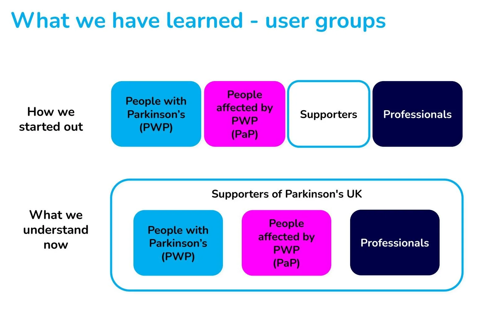
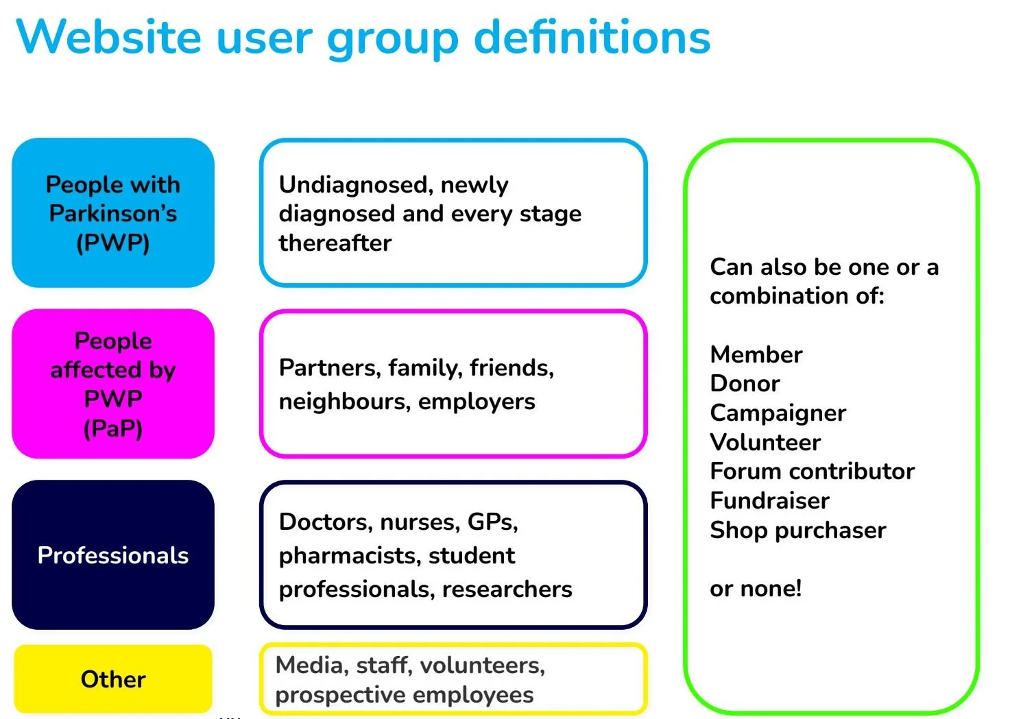
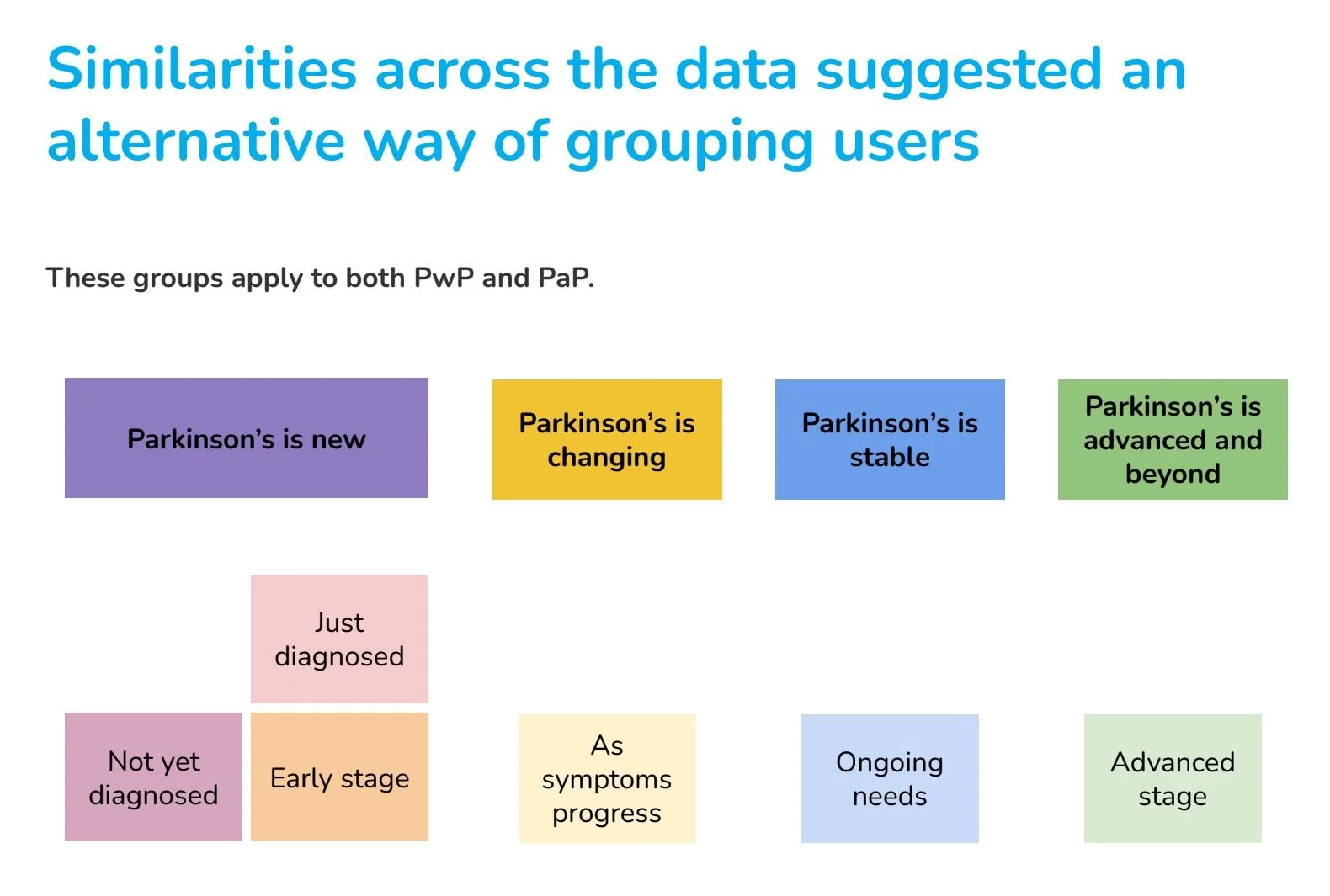
The organisation had a way of looking at users but the data was telling us something different about our audience. I drafted revised user groups based on this data:
I created empathy maps and jobs to be done and continued to build these out during the discovery.
I redesigned the onsite survey to start quantifying the responses according to the new user groups and learn more about which user groups were experiencing which frustrations. This in turn helped the team prioritise what would be worked on first.
I conducted user interviews and open card sorting exercises with 16 participants with a mix of People with Parkinson’s and People affected by Parkinson’s, and at different stages of Parkinson’s.
This enabled us to understand how users categorise and label the different types of website content and understand what content is important to them at what stage of their Parkinson’s journey and why.
I chose to combine card sorting with a user interview because of the target audience. All were unfamiliar with card sorting so running a remote study would not work. It also gave us the opportunity to probe and ask additional questions which provided qualitative insights on why people use the Parkinson’s website.

This initial period of desk research allowed us to take stock of where we were and understand where the gaps were.
I worked with the senior leadership team to prioritise the areas of concern and focus my efforts in conducting more in depth research to validate our hypotheses about who was using the site and why, and better understand the problems.
I replanned the discovery project with the following research questions:
How can we better understand users, their needs and behaviours?
How can we improve the navigation and information architecture to help users find what they are looking for quickly?
How can we improve the donation and support journeys?
I chose to focus attention on People with Parkinson’s and People affected by Parkinson’s as the data was telling us this was the bulk of our users. Whilst many areas of the business wanted to focus on other groups, this felt like Parkinson’s UK’s ‘bread and butter’.

Part 2: How can we improve the navigation and information architecture to help users find what they are looking for quickly?
I conducted GA analysis and set up reports for future. The team were not doing this and had no idea how content was performing
I ran a kick off workshop with the content team to understand all the different types of content we have and why and create alignment between content and product teams. This also helped me understand how the organisation views the content and informed the labels we would use in the card sorting.
I reviewed competitors to see how other charity organisations structured their content and balanced this with additional services such as forums, shop, donate and volunteer.

Part 3: How can we improve the donation and support journeys?
I conducted stakeholder interviews to understand how things work currently and review target audiences.
I conducted heuristic reviews of existing online journeys to highlight the problems /gaps. I quantified this with data from GA, Hotjar and the onsite survey. I used the Jobs to be Done and themes from the on site survey results to identify 6 missions users might be on when looking for support or to donate to Parkinson’s UK.
I created new targeted on site surveys to get more qualitative insight on pain points for these journeys.
I analysed page performance and user behaviour using GA4 and Hotjar.
During the writing of the research report I used Parkinson’s UK’s own AI tool to help me refine my research insights.
Findings
Phase 1
Here’s a snapshot of some of the findings from the first stage of research and desk analysis:
Each user group has a range of different information needs at different stages of their journey. People affected by Parkinson’s are usually one step ahead of People with Parkinson’s.
66% of users access the website on a mobile or tablet yet the journeys are not optimised for this traffic.
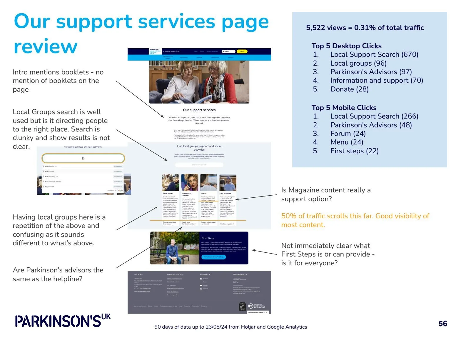
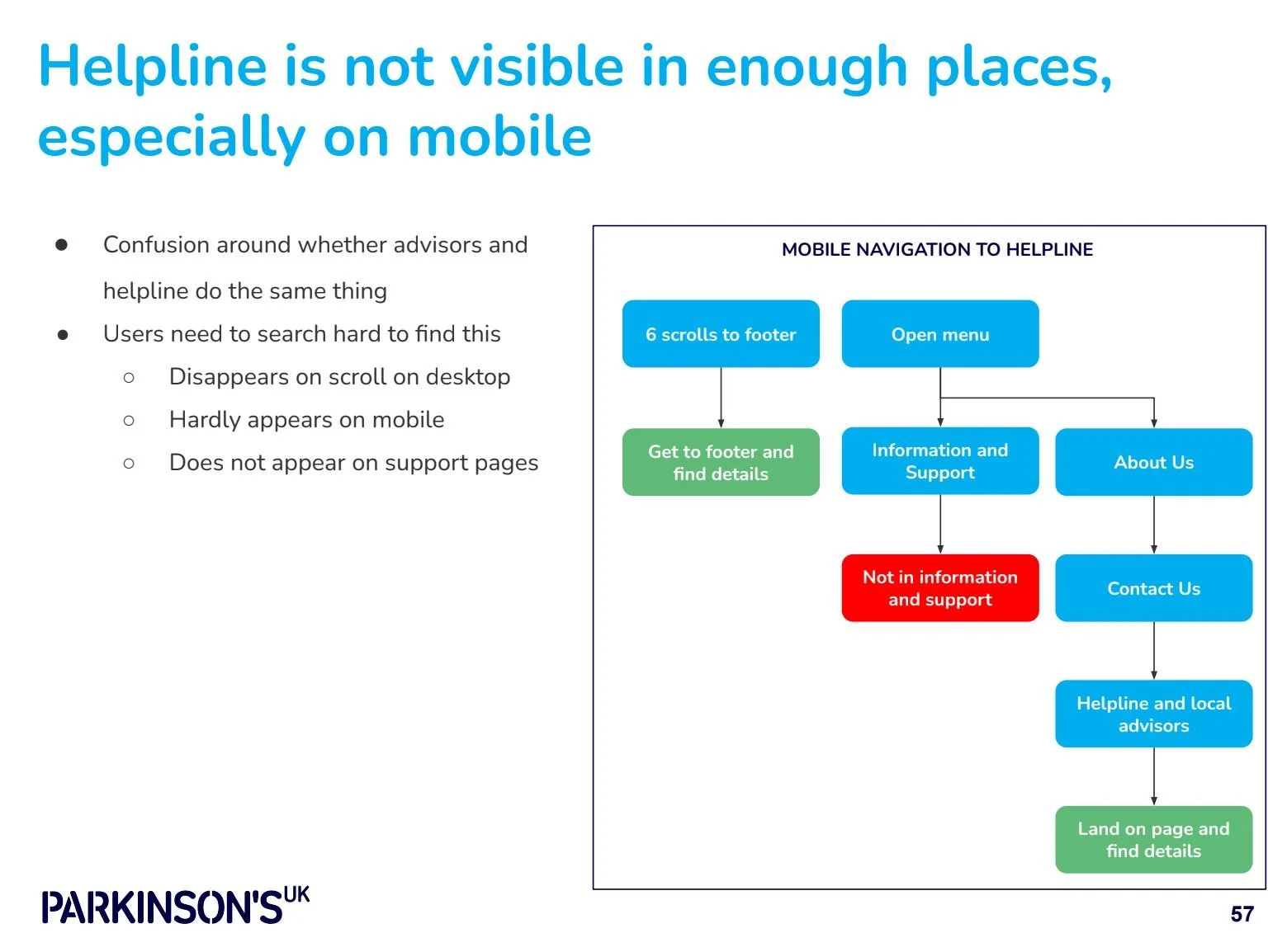
Users struggle to find and understand the support options available to them, it appears in multiple places and are therefore unable to find the help they need especially in an emergency.
Content is not organised or labelled effectively or according to user need.
Users expect the site to be all encompassing and it does not live up to expectations, e.g. there are separate log ins for members and for the forum.
Users find the donation journey confusing, there are multiple options and entry points and no clear explanation or access to information on what the money goes towards.
Phase 2
Part 1
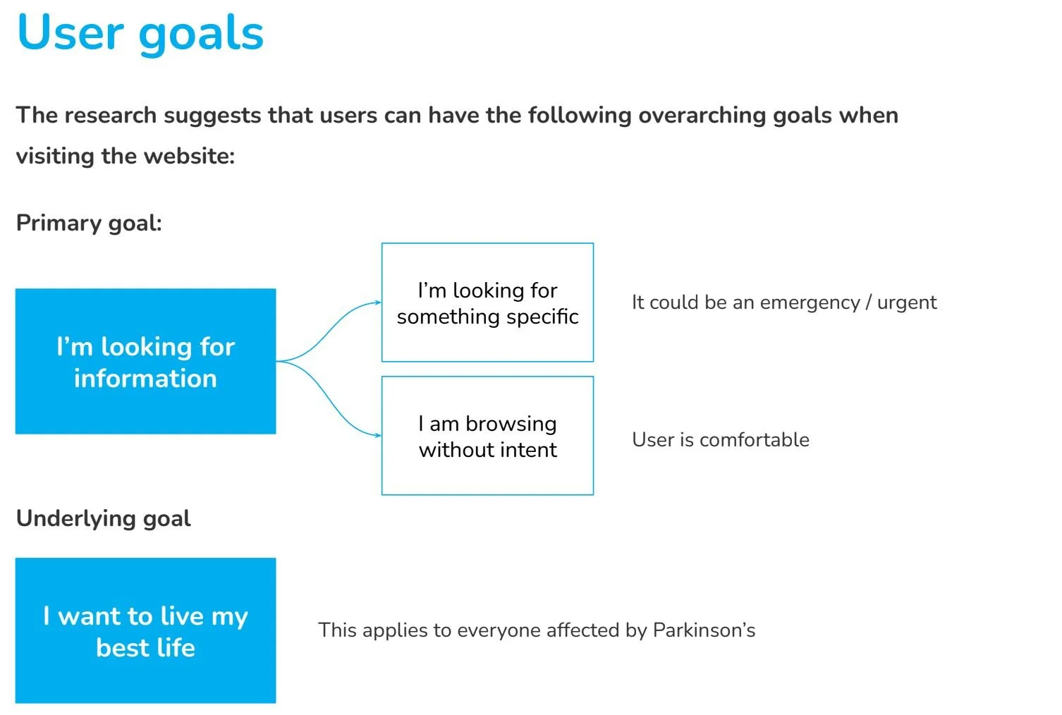
The majority of users visit the site because its a trusted source of information and they’re looking for an answer to a question. It might be specific or general but all with the ultimate goal of living their best life.
For the first time ever the organisation was able to really see who was using the website and what type of content they were viewing.
Phase 3
Provided detailed analysis on the journeys along with insights and actionable recommendations to make improvements.
Part 2
The card sorting provided insight into users’ mental models of the content on the website and highlighted pain points that could be tackled in the website redesign. It also raised more questions that could be answered as future rounds of testing. I delivered 10 insights and 11 actionable recommendations such as:
Content Sensitivity and Readiness: The readiness to engage with certain content varies among users, influenced by where they are at in their Parkinson's journey, personal background and personality. This insight underscores the need for a sensitive content strategy that can accommodate users at different stages of readiness.
Desire for Hope and Progress: Users express a strong desire to stay informed about new developments and changes in Parkinson's research. This points to the importance of regularly updating content with hopeful and forward-looking information.
Impact
I changed the way the organisation views website users. The organisation believed use was related to the user’s relationship to Parkinson’s but the research showed website use was more related to the stage of Parkinson’s and the user’s behaviour - searching for the answer to a specific question or browsing for more general information about the disease and / or charity.
I identified and quantified key website user groups and user journeys. I also set up ongoing measurement to monitor this going forwards. Now the team have a good understanding of who is using the website and what they are looking for and can prioritise the most highly used areas for the redesign.
The Empathy Maps and Jobs to be Done provided useful guidance and additional information to help the design team better understand who they are designing for.
I set up reports and enabled the team to use Hotjar and GA to monitor user behaviour and track design change impact.
I established a customer panel and introduced Lyssna as a tool for conducting research.
Learnings
I would have liked to have run the interviews with a wider cross section of participants from the user groups. We ran out of time and couldn’t get enough responses from the membership base to equally represent each user group. What we did get was enough to move forward with although wasn’t officially ‘quantitative data’. With more time I would have gone on to repeat the tests and go deeper with tree testing to validate what was coming out of this research.
Working in silo really kills productivity. Time could have been saved if teams had been better at sharing research and plans. Speaking to all involved teams early in the process helped bridge these silos and bring the other stakeholders on board.
Conducting research with people with Parkinson’s and those affected by Parkinson’s was challenging and surprising. I needed to be adaptable and receptive to their needs - more so than in any other interviews I have run.