Homepage Redesign
Working with a cross functional team to lead the redesign of one of the key pages of the Selfridges website. Balancing business and customer need to make the homepage more commercial, increase click through rate, add to bag and sales.
Stakeholders: Product, UX, Analytics, Creative, Editorial, Trade, Marketing
Tools: Miro, Content Square, Google Analytics, UserTesting.com
Methods: Data Analysis, Usability Testing, Prototype Testing, Workshops
June 2021
Problem
The homepage is a key page for Selfridges and generates a third of all page views. Multiple teams across the business are invested in it’s performance but for different reasons.
A few problems were identified:
Low engagement rate on the homepage.
Business attention on features was high but traffic to feature article content was also low.
Insights from previous research that the homepage looked like a magazine rather than a shop window.
We wanted to create a homepage that would:
Entice and engage new and existing customers wherever they are
Encourage customers to stay and spend
Keep customers coming back for more
Have high commerciality
Hypothesis
Making the homepage more commercial would increase click through rate and add to bag.
Redesigning the content and hierarchy would provide customers with more inspiration and information about the brand and what Selfridges has to offer and increase motivation to buy.
Research Methods and Process
Research Goals:
Understand current performance and what the pain points are
Understand processes used to update the page
Test the new design to see if it solves the problems (see findings)
Understand current performance & processes
Collaborated with Analytics: I worked closely with the Analytics Manager to come up with a series of questions that we could each answer during this piece of research. We used GA, Content Square’s various analysis tools and a very small amount of usability testing to answer them.
We were only able to run a small amount of usability testing as we were in the middle of trialling a new tool and we used the homepage as an example. Had this not been the case I would have conducted more in depth analysis on different user groups and different devices.
Joint Synthesis: We analysed and synthesised our findings and put together a report that outlined an overview of performance and that showed the key problems backed up with qual and quant data - for example, customers were not scrolling and missing important information and products.
Workshop roadshow: We ran workshops with the teams involved in the homepage - marketing, editorial, creative, product & UX, trade and the senior leadership team. We used these workshops to understand more about what those teams wanted and needed from the homepage but also the processes involved with updating and maintaining it. We also wanted to show them our research, create alignment on the problems and use this research to ideate on how we could improve the homepage experience.
Developed principles and recommendations: Using all the feedback from the workshops we were able to identify some clear principles and recommendations to follow in the redesign - for example,
Be clear and direct - say what we mean and take people to what they expect. This is referring to ensuring links have the correct names, and pages have content users expect to see on it.
“Curated content would help me choose and give me inspiration.”
“I like the editorial content. I feel like it is subtle advertising and informative.
It adds a layer of value to my shopping experience.”
Testing the new experience
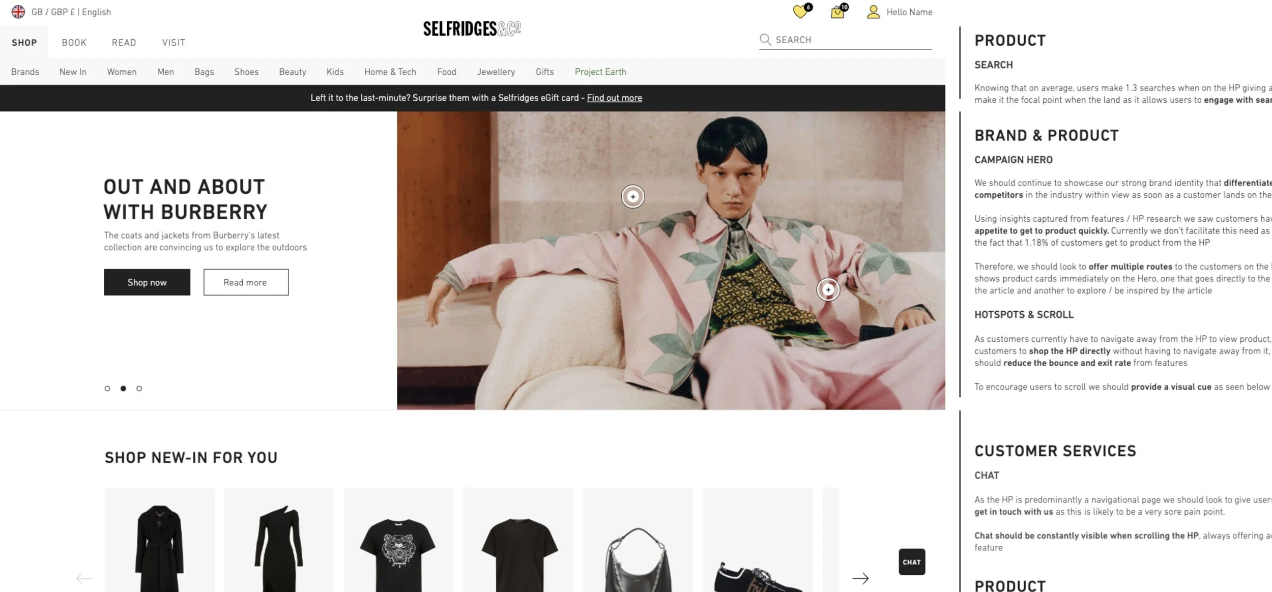
I worked with UX design to develop a high fidelity prototype of a new homepage design based on all the research to ensure it was meeting both the business and customer needs:
Showcasing all that Selfridges has to offer - including services, cinema and store info
The desire to promote feature articles and balance this with enough routes into product
Improve visibility and choice of products and categories
Key changes:
Reducing the height of the header image to allow for more content to be seen on smaller screens
Increasing the number of products contained within the carousels
Changing the order of the carousels to put the more engaging ones higher up the page
Changing the layout and how we presented features, ensuring we write better headlines and CTAs
Adding additional CTAs to features to allow customers the choice of shopping the edits/collections or reading the feature articles (when relevant)
Due to time constraints we unfortunately ran out of time to run any usability testing on the design. Instead we chose to A/B test the new design against the existing version to evaluate success.
Findings
The findings from the initial data analysis included:
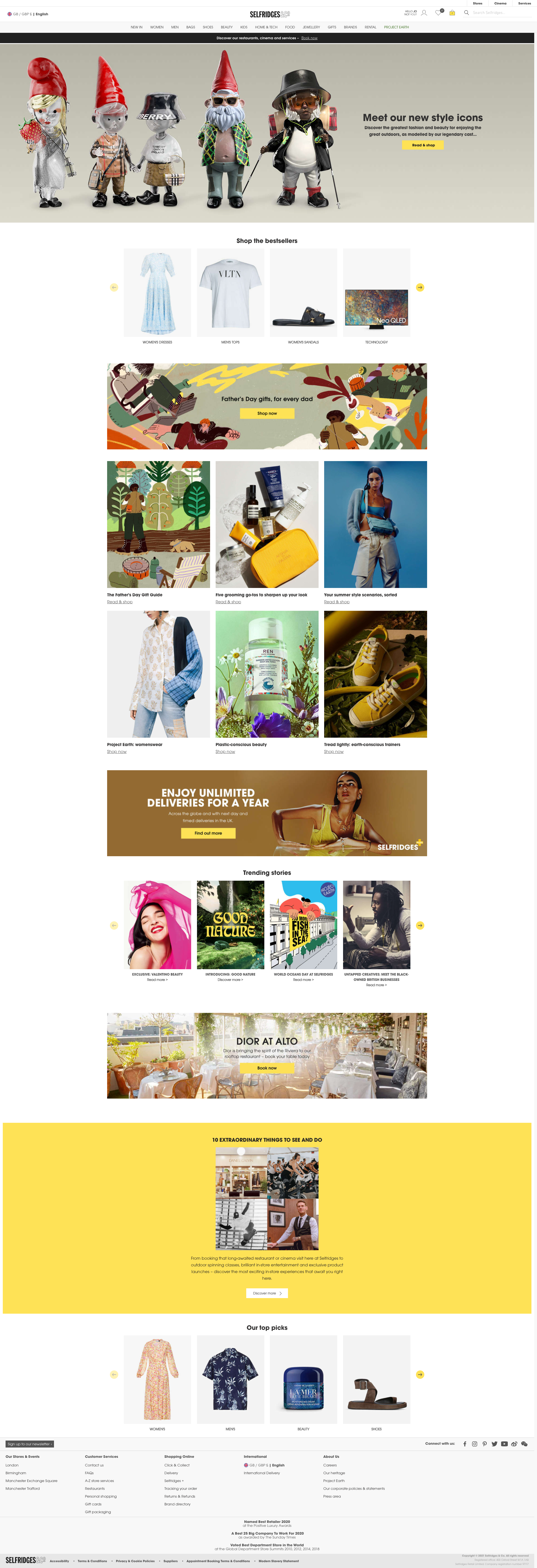
Users felt the homepage looked more like a magazine than a shop and it was hard to find categories and products.
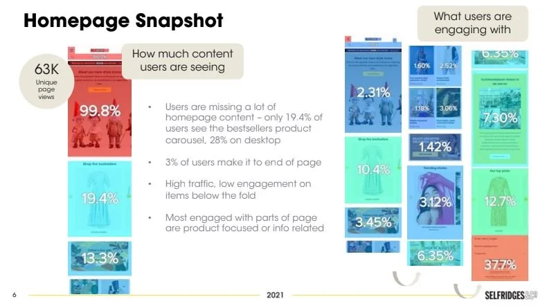
Users weren’t scrolling. Less than 20% of total visitors ever scrolled below the fold, missing 80% of content.
The product carousels were the most interacted with / attractive parts of the page indicating that customers wanted quick access to product.
Users were not seeing what they expected so they left - bounce and exit rates for the editorial pages linked to from the homepage were much higher than overall site averages.
CTR to features from the homepage was low, and bounces high.
Most of the traffic was coming from mobile users but revenue from desktop users was higher.
Mobile users have a lot of content to navigate on a small screen - making it difficult to find what they want.
Some seasonal campaigns do not resonate with our audiences at all.
These findings were used in the workshop to brainstorm reasons why and solutions - all of which fed back into the new prototype you can see below.
Impact
The A/B test showed a 6.7% increase in CTR and a 3.5% increase in conversion.
The reduction of the header enabled a higher percentage of clicks above the fold.
Desktop version increased average order value by 8% although saw fewer transactions, while the mobile version saw increases in both AOV and transactions.
Adding ‘Shop Now’ call to action buttons in addition to the ‘Read more’ CTAs provided a faster journey to product and increased traffic.
Other interesting things to note:
There were small % decreases in bounce and exit rates of <2%.
Increases in scroll rate and time spent on the page.
Learnings
There were a lot of teams involved in this project and it was hard to keep everyone aligned and in agreement. As such this caused a lot of delays in the project and contributed to us running out of time towards the end. If I could do this again I would have involved some of those teams earlier, particularly in the questions gathering phase, so ensure they felt involved and were getting their own questions answered.
There are lots of ways to get quick and dirty user feedback on designs - including enabling the designers to do their own research. This was early in my UX research journey when I was responsible for all the testing. Projects like this helped us realise that we needed to democratise research and enable others.
I could have run further qualitative analysis during the A/B testing phase. The ideal would have been to usability test the new design however we ran out of time and frequently found ourselves in this position. In later projects when this happened, I ran usability tests or conducted interviews with customers during the A/B test and showed customers both versions. This gave us valuable insight and ideas for further development which went on to the backlogs. This data also proved useful as a foundation for benchmarking consequent performance and customer experience.